Coca-Cola is changing its cans but not its recipe
The next time you shop for Coca-Cola at the grocery store, it may look different. Coca-Cola is undergoing a major packaging rebrand, changing up its iconic can design and logo.
Company launches sneak peek video
You won't even have to wait long to see the rebranded cans because Coca-Cola has leaked a sneak peek video of the new design. Look for a new typeface on the logo that's meant to be "playful."
The cans will still feature the iconic red-and-white color palette, but will switch back to the vertical logo they used to have.
There will also be "minor adjustments" to differentiate between the different versions of Coca-Cola. This will make it easier for you to find flavors like Lemon or Cherry without accidentally grabbing the classic recipe.
Coke Zero sees a massive overhaul
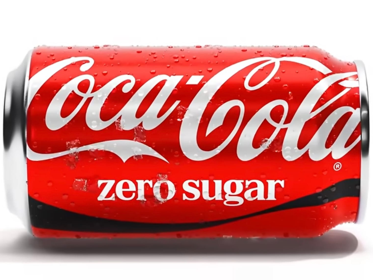
The line getting the biggest overhaul is Coke Zero. It will look more like the typical classic can, without the black font and logo.
Look for the Dynamic Ribbon design on Coke Zero cans, and the bottles will have a black cap, unlike the classic recipe that has a red cap.
Another big change is the words "Zero Sugar" under the logo.
Rebranding is nothing new for Coca-Cola
As fun as the rebranding is, this is nothing new for the company. They've changed up the color, logo, and design several times over the decades. It's common for them to offer seasonal packaging too, specifically for Christmas.
The last time the company did a major rebrand was in 2021, so it wasn't even that long ago. That redesign made the can more minimalistic and simple looking.
Get your collector cans while you can
If you're one of those people who loves collecting all things Coca-Cola related, now's the time to grab the current design while you can still find it.
Source: Allrecipes